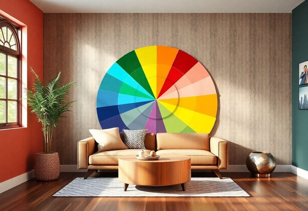
Understanding the Basics of the Color Wheel
The color wheel serves as a visual representation of colors, aiding in selecting appropriate hues for your interiors. In interior design, we categorize colors into three main groups: primary, secondary, and complementary. Primary colors include red, yellow, and blue. When mixed, these produce secondary colors like green, purple, and orange. Complementary colors sit opposite each other on the wheel, such as blue and orange. Incorporating these contrasting colors can energize a room, infusing it with vibrancy and life.
Utilizing the Color Wheel in Interior Arrangements
Choosing colors using the color wheel for interior design might seem overwhelming, but a few fundamental principles can ease the process. One key guideline is the 60-30-10 rule. This means that 60% of your space should be in a dominant color, 30% in a secondary color, and 10% in accents. By adhering to this rule, you can achieve a balanced and visually appealing composition.
The Emotional Impact of Colors
Colors have a profound effect on our emotions. For instance, warm colors like red and orange evoke feelings of joy and energy, while cool colors like blue and green promote calmness and relaxation. When selecting colors for your interiors, it’s vital to consider their emotional impact to create a space where you feel comfortable and inspired.
The Relationship between Color Wheel and Design Styles
Matching colors to your design style is an essential aspect of interior design. For example, Scandinavian design favors light, neutral colors that enhance natural light. In contrast, industrial style embraces darker, raw hues that reflect an urban vibe. Utilizing the color wheel for interior design allows us to find the perfect combinations that highlight the unique character of our homes.
Effective Color Palette Examples
You can find inspiration for color palettes everywhere, but utilizing tools like the color wheel can sharpen your choices. For instance, pairing shades of blue with white can create a refreshing effect, while combining pastels with bold colors injects energy into a space. Don’t forget about complementary colors—these can add a burst of life to any style.
Practical Tips for Painting Walls
When painting walls, the final effect is paramount. Testing colors on small sections of your wall can show how a color reacts to both natural and artificial light. By using the color wheel for interior design, you can ensure stunning results without unwelcome surprises.
Conclusion
In conclusion, the color wheel for interior design is an invaluable tool that will help you actualize your dream spaces. Play with colors, experiment, and don’t hesitate to break the mold! Your home is your personal canvas where you can showcase your identity.
Disclaimer
The tips provided are for informational purposes and do not substitute for professional consultations regarding interior decor.