Understanding the Color Wheel in Interior Design
The color wheel is a visual representation of colors and their relationships. In the context of interior design, it enables you to understand which colors work well together and which may clash. Primary colors—red, blue, and yellow—serve as the foundation, while secondary colors like purple, green, and orange offer delightful possibilities for creativity. Understanding this wheel is key to effectively applying colors to your space.
Three Main Color Categories in Home Design
The color wheel typically categorizes colors into three groups: primary, complementary, and analogous. Primary colors are those that cannot be created through mixing; complementary colors sit directly opposite each other on the wheel, creating contrast, while analogous colors sit next to each other, providing a cohesive palette. Using these categories in interior decor can greatly enhance the aesthetic appeal of your space.
The Concept of Color Harmony in Interior Design
Color harmony involves creating balance among colors in your room. Utilizing the color wheel in design can make achieving this harmony easier. For example, if you’re choosing rich navy blue, you can add elements in soft green hues to create a pleasant, relaxing atmosphere. Harmonious combinations promote feelings of calmness and happiness.
Inspiration for Using the Color Wheel in Different Rooms
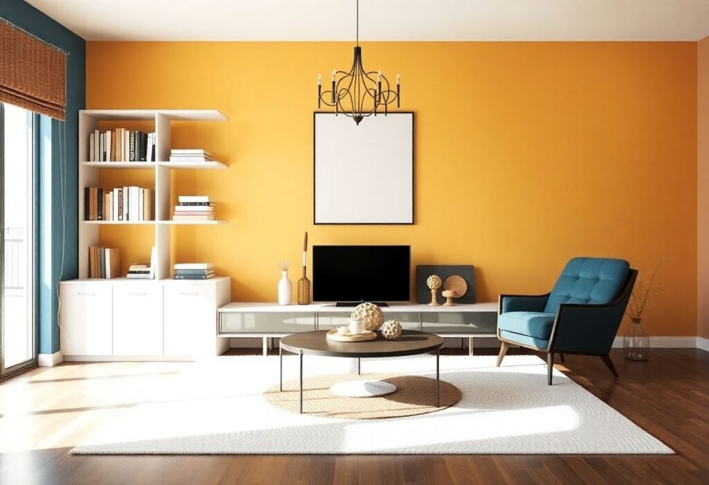
In the kitchen, color zones can significantly impact appetite. Soothing greens and beige tones can introduce an aura of freshness. Meanwhile, soft pastel colors in the bedroom will encourage relaxation. Additionally, bold accents in the living room can inject energy and life. By leveraging the color wheel in various interiors, you can pursue creative design approaches.
The Role of Light in Color Perception in Interior Design
It is essential to remember that the light in our rooms also influences how we perceive colors. Different lighting sources alter our color perception, so when planning decorations, it’s crucial to consider not just wall colors but also how the space will be lit. For example, warm light can soften colors, while cool light might enhance them.
Personal Style and the Color Wheel in Design
A key element of design is personal style. Whether you lean toward modern minimalism or traditional charm, it’s essential to tailor your color palette to your preferences, using the color wheel as a guide to ensure consistency. Let your personality reflect in your choices and create an inviting atmosphere.
Conclusion
Utilizing the color wheel in interior design is a powerful method for simplifying the design process. Discover the beauty of color harmony and let your home reflect your lifestyle. Embark on this journey to create your dream space filled with vibrant colors!
Disclaimer
This article is for informational purposes only and should not replace professional advice from an interior design specialist.


