
Understanding the Complementary Color Scheme
A complementary color scheme involves pairing colors that are opposite each other on the color wheel, such as blue and orange or red and green. This contrast not only creates visual interest but also generates a sense of harmony within the space. By selecting colors that enhance each other, you can achieve a balanced and dynamic interior.
Benefits of Complementary Color Schemes
Utilizing a complementary color scheme in your home can evoke emotions and set specific moods in different areas of your living space. For instance, a combination of yellow and purple can lend an air of sophistication to a kitchen, while red and green may induce a feeling of warmth and comfort in a cozy living room. The right color pairings allow you to express your individual style while also enhancing everyday living.
Choosing the Perfect Colors
To effectively use a complementary color scheme, start by assessing the existing color palette in your home. Identify dominant shades and consider which complementary colors would fit harmoniously. Reflect on colors that resonate with you personally and make you feel at ease. Test paint samples in various lighting to see how they can change throughout the day, ensuring you choose the perfect pairing.
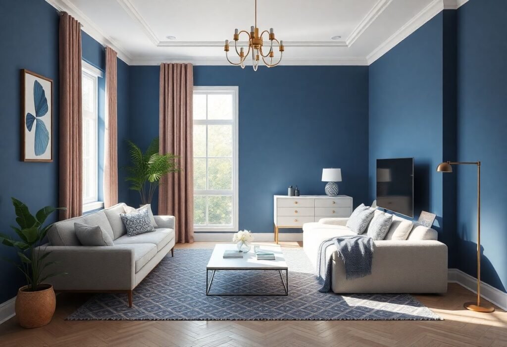
Examples of Complementary Colors in Different Rooms
For example, in a dining area, combining a deep navy with crisp orange can create a stylish and energetic feel. In a bedroom, pairing a soft mint green with coral brings a soothing yet invigorating ambiance. Implementing a complementary color scheme doesn’t have to mean a complete overhaul—start with accent pieces such as cushions, throws, or artwork to gradually introduce bold colors.
Mixing Different Shades
When applying a complementary color scheme, it’s essential to mix different shades for a more nuanced look. Avoid overly bright or saturated colors that can overwhelm a space. Instead, opt for softer tones that complement the dominant shade, creating a balanced and inviting environment.
The Impact of Lighting on Color Perception
Lighting plays a crucial role in how we perceive colors in a room. Natural light can enhance color vibrancy, while artificial lighting may shift their essence. When planning your complementary color scheme, consider the types of lights you’ll use—warm white bulbs can create softness, emphasizing the beauty of your color combinations. Testing color samples under different lighting will ensure you achieve the desired aesthetic throughout the day.
Conclusion
Embracing a complementary color scheme can dramatically enhance your living spaces, providing them with sophistication and flair. Don’t be afraid to mix bold colors and create inviting atmospheres that reflect your personality. So, unleash your creativity and enjoy the transformation that the right colors can bring to your home. It’s time to elevate your interior design game!
Disclaimer
This article is for informational purposes only and should not replace professional interior design advice. Always consult an expert before making any significant changes to your home decor.